The Clockwork Collection: the book covers of A Clockwork Orange
-
Anna Edwards
- 26th August 2021
-
category
- Blog Posts
-
tagged as
- A Clockwork Orange
- The Clockwork Collection
2021 marks the 50th anniversary of the first release of Stanley Kubrick’s film adaptation of A Clockwork Orange, and 60 years since Anthony Burgess completed his most famous novel.
To celebrate the anniversary, we are presenting an online series called The Clockwork Collection, with a focus on A Clockwork Orange.
Each month we’ll be sharing a highlight from the Burgess Foundation’s archive. Expect literary manuscripts, vinyl, books, audio, journalism, music scores, photographs and more. For more information on the items discussed in the series, please contact our archivist.

The Clockwork Collection: The book covers of A Clockwork Orange
This issue in the Clockwork Collection series draws on the Burgess Foundation’s extensive book collection to take a closer look at some of the memorable cover designs for A Clockwork Orange, focussing largely on the UK market.
The changing way in which the novel has been visually communicated throughout its publication history reflects not only trends in design, but also the closely interwoven relationship between the novel and its film adaptation.
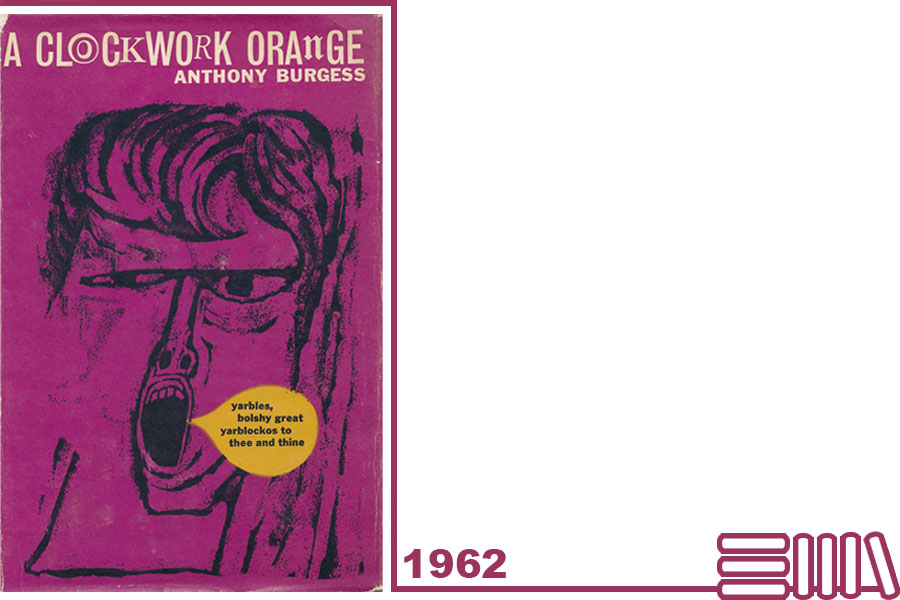
A Clockwork Orange was first published in 1962 with a cover designed by the artist Barry Trengrove.
Trengrove took inspiration directly from Burgess’s novel. His strong use of colour – a combination of black and pink – and the central illustration of the face of a tormented, open-mouthed youth, shouting an obscenity in nadsat, hints at the book’s aggressive content, subversive message, and its linguistic inventiveness.
Although the book sold poorly on publication, Trengrove’s design gained some acclaim and it was featured in the 1963 publication 17 Graphic Designers London, a collection of work by leading contemporary designers.
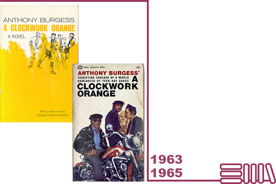
In America, paperback editions of A Clockwork Orange appeared throughout the 1960s. These are the copies released by Norton in 1963 (left) and Ballantine Books in 1965 (right).
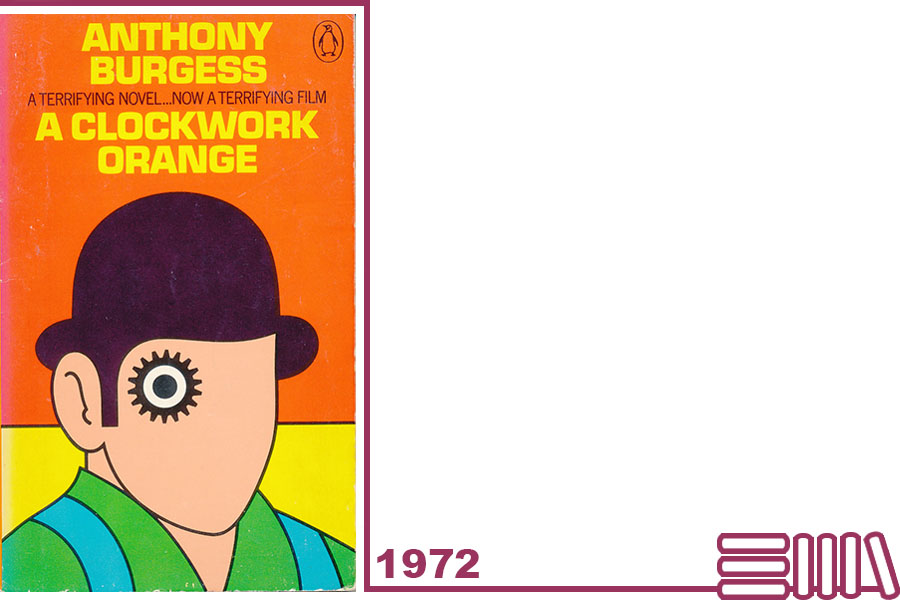
David Pelham’s 1972 design for Penguin was to become one of the most iconic book covers of all time, a fact made all the more impressive as Pelham only stepped in to create the cover at the last minute.
Penguin’s new edition was timed to coincide with the UK release of Stanley Kubrick’s film adaptation of Burgess’s novel. Kubrick had forbidden Penguin from including design elements from Philip Castle’s film poster in the book’s cover and so Pelham, Penguin’s Art Director, was tasked with commissioning another artist to create an entirely new design. When the chosen designer submitted their work, Pelham was unhappy with the result and, with the print deadline looming, he decided he had no choice but to create the design himself during an all-night session. The result was a visually arresting cover, heavily influenced by Kubrick’s film.
Pelham’s design is a simple line drawing that depicts a droog, looking out boldly from the front cover and wearing a bowler hat. (Famously, there are no bowler hats in Burgess’s novel.) The droog’s eye is turned into a cog, simultaneously alluding to the mascara-lashed eye of the novel’s protagonist, Alex, and the ‘clockwork’ theme of the novel: the danger of turning a ‘living organ … into a mechanical emanation of itself.’ (Anthony Burgess, ‘Juice from A Clockwork Orange’)
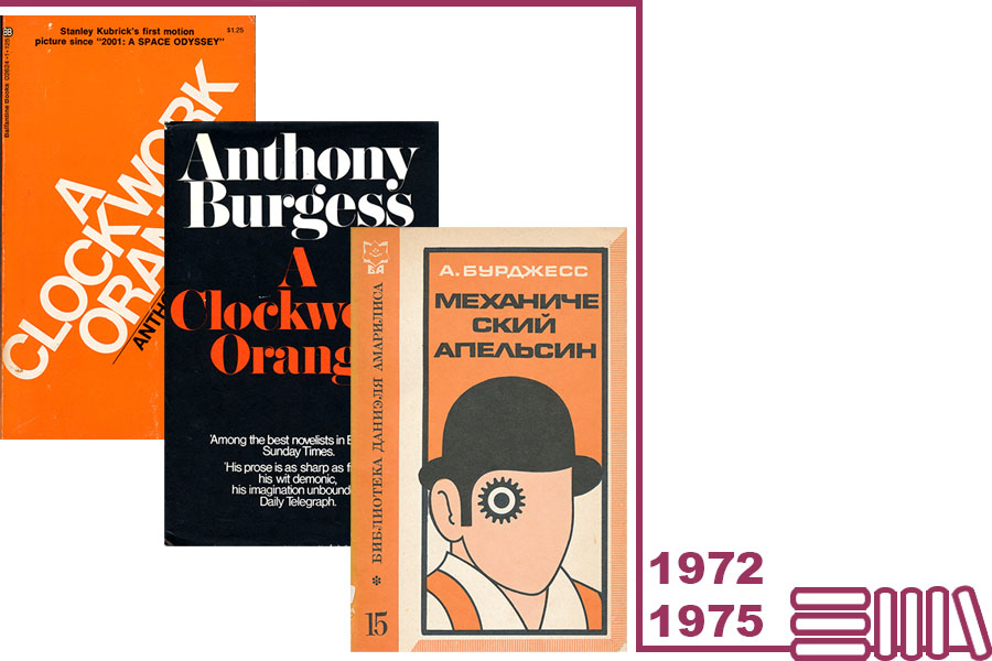
Although it was Pelham’s design that would ultimately dominate readers’ imagination, the 1970s also saw the release of several typographical covers, such as these examples from Ballantine Books in 1972 (left) and Heinemann in 1975 (middle).
The influence of Pelham’s cover would go on to extend well beyond the English-language territories for which the Penguin edition was commissioned, as this Russian-language translation reveals (right).
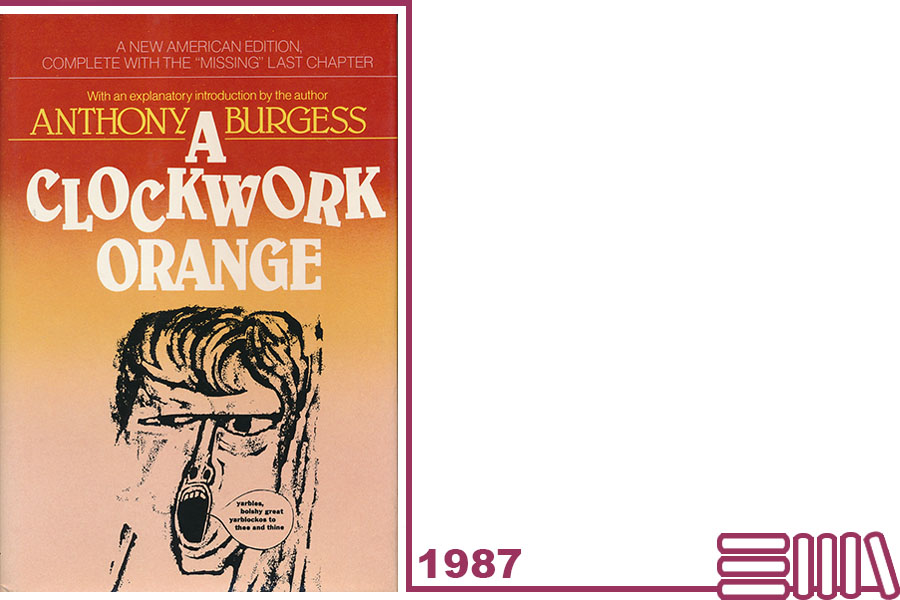
In 1987, Norton released a new hardback edition which revived Barry Trengrove’s original artwork and marked the first time that chapter 21 had been published in America.
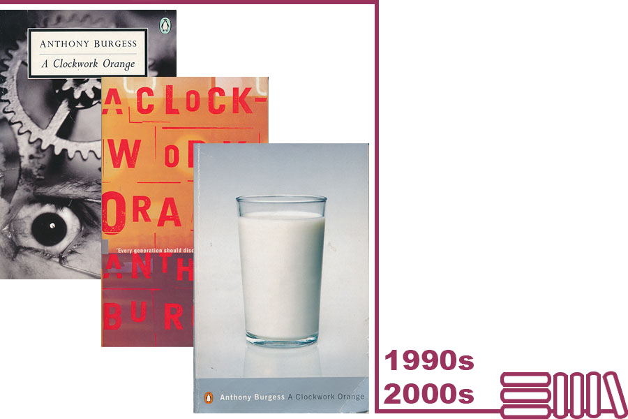
The 1990s and early 2000s saw A Clockwork Orange included in both Penguin’s Twentieth-Century Classic and its Essential series, with a clear shift in design. From left to right above:
- Lionel F. Williams and SOA / Photonica’s photographic cover for the 1996 Penguin Twentieth Century Classic edition, drawing on the clockwork theme and Kubrick’s on-screen depiction of Alex undergoing aversion therapy.
- Dirk Van Dooren’s typographical design for the Penguin Essential edition in 1998, which echoes a cut and paste ransom note.
- The Penguin Modern Classic edition of 2000, featuring photography by Véronique Rolland. The glass of milk alludes to the ‘milk-plus’ enjoyed by Alex and his friends in the Korova Milkbar.
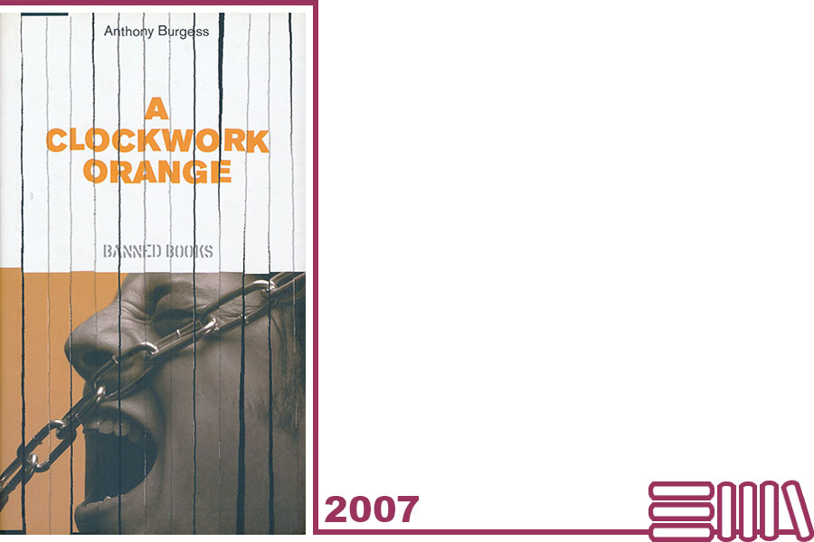
In 2007, A Clockwork Orange was one of 25 titles released as a limited edition reprint by Paperview UK as part of The Independent newspaper’s Banned Books series. A Clockwork Orange was the first in the series and given away for free with the newspaper. A previous give-away hardback was distributed by the Observer in the 1980s.
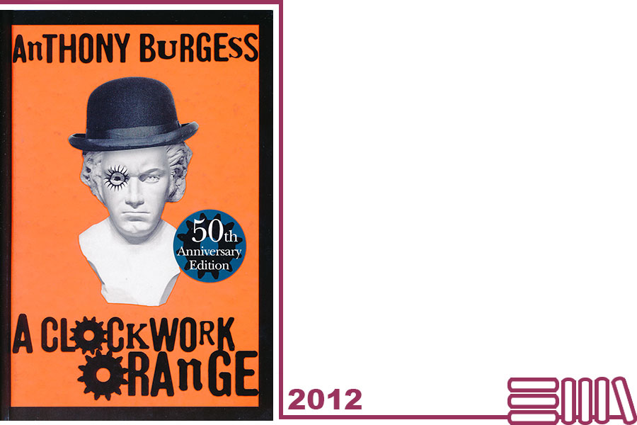
2012 marked the fiftieth anniversary of the first publication of A Clockwork Orange.
In the UK, William Heinemann commissioned a new cover for its special anniversary edition which incorporated several earlier design elements. A bust of Beethoven, complete with bowler hat and cog, dominates the front and echoes the ‘cog-eyed droog’ of Pelham’s 1972 cover, as well as pointing to Alex’s favourite composer. The typography is reminiscent of that used on the 1962 first edition by Barry Trengrove.
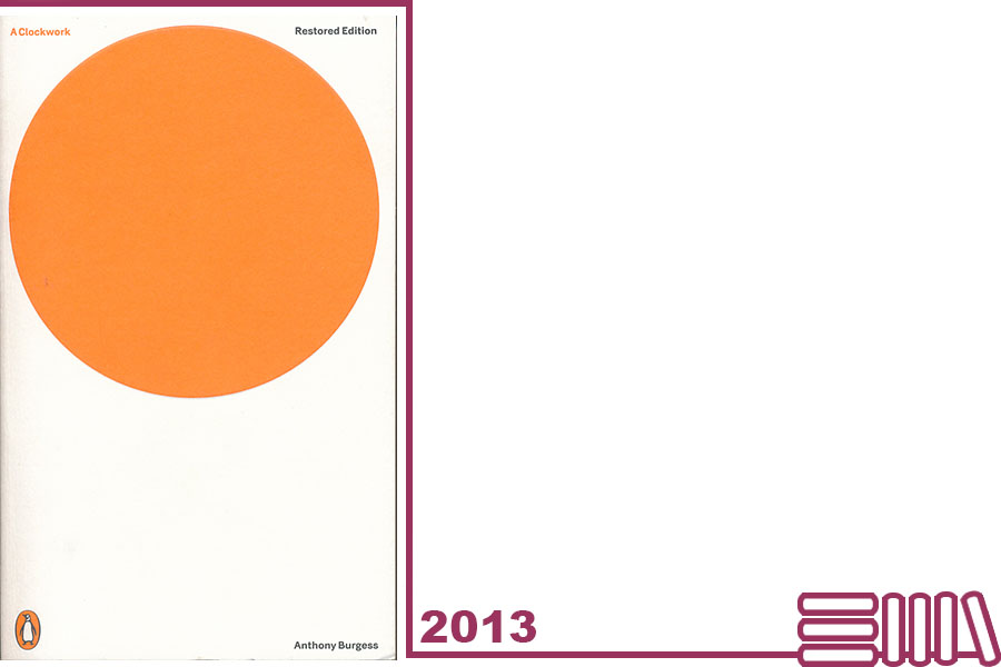
Jonathan Barnbrook’s design for Penguin’s paperback edition of 2013 marked a radical departure from previous covers.
Barnbrook’s minimalist design features a simple, large orange circle on a white background, and was conceived as a deliberate departure from the bright colours and iconography of Pelham’s 1972 cover.
In an interview with Mark Sinclair for Creative Review in 2013, Barnbrook explains that his cover is, in a sense, Alex in abstract, and deliberately leaves room for the reader’s own imagination. The organic – the orange – is hemmed in by the white around it:
It could be the glass of ‘moloko’ that Alex drinks, but it could also be a piece of 60s abstract art [in] one of the interiors of the houses that Alex breaks into; [or] the sun – energy and life – which Alex represents; the all-seeing eye of the government; or the eye of Alex, unblinking, forced to watch atrocities when being ‘treated’.
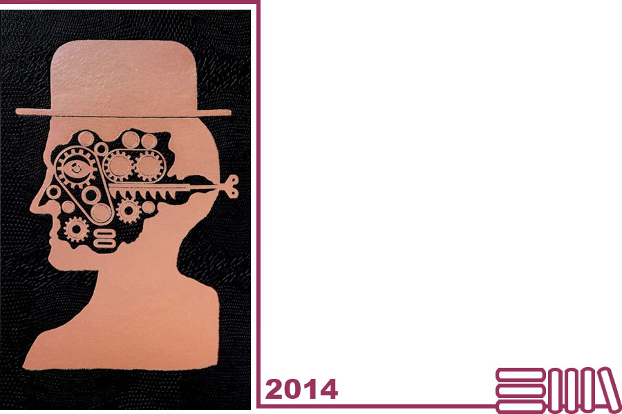
The Folio Society released a special hardback edition of A Clockwork Orange in 2014, bound in textured black paper and blocked with holographic foil. It includes a frontispiece and six colour illustrations by Ben Jones.
Discussing the inspirations for his designs, Jones explains that he was keen to create a ‘subtle menace’ in his work: ‘something that makes you feel a bit jittery’. The frontispiece portrays a droog’s head and shoulders in profile; his bowler-hat an acknowledgement of Kubrick’s key role in ‘the book becoming immortal’. In all other respects, Jones was keen to move away from Kubrick’s visual style and deliberately avoided watching the film while creating his artwork, so as to ‘develop my own take on the book and stay true to Burgess’s vision.’
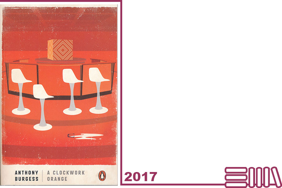
In 2017 A Clockwork Orange was one of four limited edition Penguin Classics, created to coincide with the Into the Unknown science fiction exhibition at the Barbican. The cover, designed by Jamie Keenan, sees the Barbican’s Martini Bar reimagined as the Korova Milkbar.
Which cover is your favourite?


